棒グラフ
普通の棒グラフ
小樽市の地域ごとの家庭数の棒グラフ。
- #変数barにggplotをdataデータを基にして適用
- bar <- ggplot()+
- #geom_pointで棒グラフの指定、横軸はregionをhouseholdsの値を参照し昇順に並び替えたもの、縦軸はH27のデータを用いる。
- geom_bar(data = data,mapping = aes(x =reorder(region,-households),y=households),stat="identity")
- #bar0.pngとして出力
- ggsave(file="bar0.png",plot = abc,width = 30,height = 5)
色付き棒グラフ
上の棒グラフに色を付けたバージョン。
- abc <- ggplot()+
- #地方ごとに色を指定するfill=districtを追加
- geom_bar(data = data,mapping = aes(x =reorder(region,-households),y=households,fill=region),stat="identity")
- ggsave(file="bar1.png",plot = abc,width = 30,height = 5)
地方ごとの棒グラフ
小樽市のざっくりの地域ごとの家庭数の棒グラフ。(オタモイ1丁目、2丁目をまとめてオタモイとしてカウント)
- abc <- ggplot()+
- #regionをdistrictに変更
- geom_bar(data = data,mapping = aes(x =reorder(district,-households),y=households,fill=district),stat="identity")
- ggsave(file="bar2.png",plot = abc,width = 30,height = 5)
人口割合を示す棒グラフ
小樽市の地域の割合を表したグラフ。(オタモイなら1丁目と2丁目で色を微妙に変えているが、画像ではわかりにくい)
- abc <- ggplot()+
- #position="fill"を追加
- geom_bar(data = data,mapping = aes(x =reorder(district,-households),y=households,fill=district),stat="identity",position="fill")
- ggsave(file="bar3.png",plot = abc,width = 30,height = 5)
棒グラフを丸めたもの
色付き棒グラフをまとめたもの
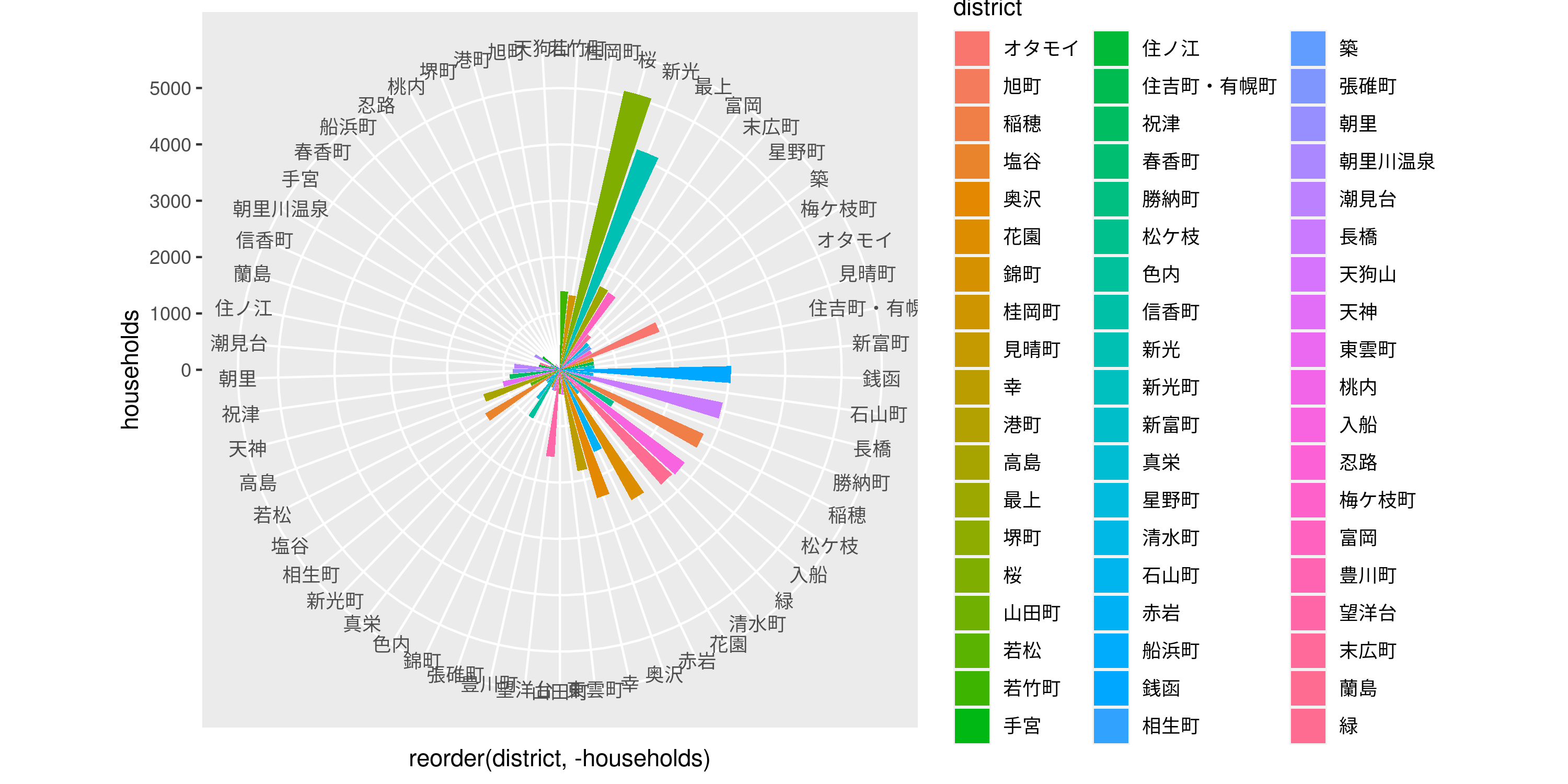
- abc <- ggplot()+
- geom_bar(data = data,mapping = aes(x =reorder(district,-households),y=households,fill=district),stat="identity")+
- #coord_polarを追加
- coord_polar()
- ggsave(file="bar5.png",plot = abc,width = 5,height = 5)