箱ひげ図
縦箱ひげ図
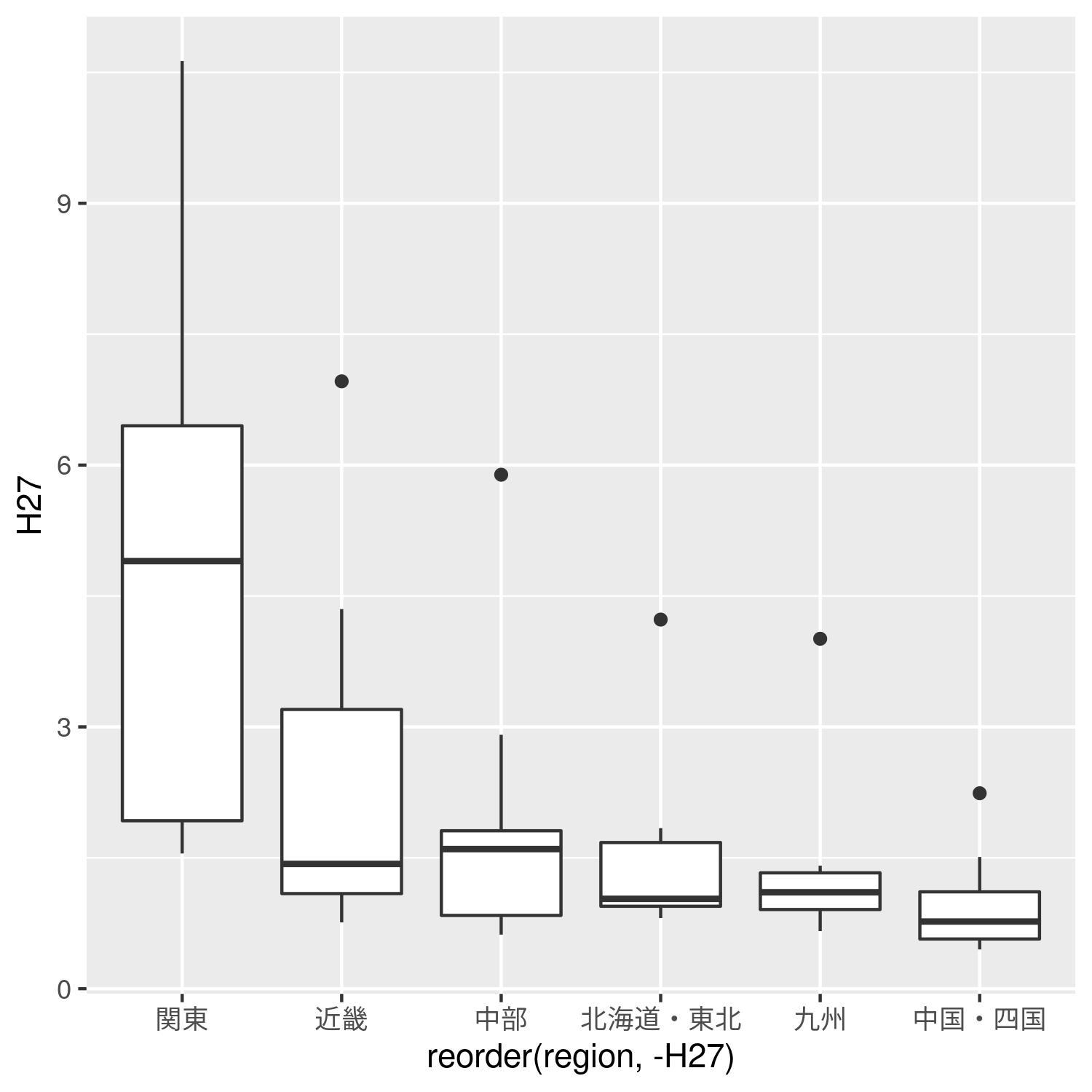
- #変数abcにggplotをdataデータを基にして適用
- abc <- ggplot()+
- #geom_boxplotで箱ひげ図の指定、横軸はprefectureをH27の値を参照し昇順に並び替えたもの、縦軸はH27のデータを用いる。
- geom_boxplot(data = data,mapping = aes(x =reorder(region,-H27),y=H27))
- #boxplot0.pngとして出力
- ggsave(file="boxplot0.png",plot = abc,width = 5,height = 5)
横箱ひげ図
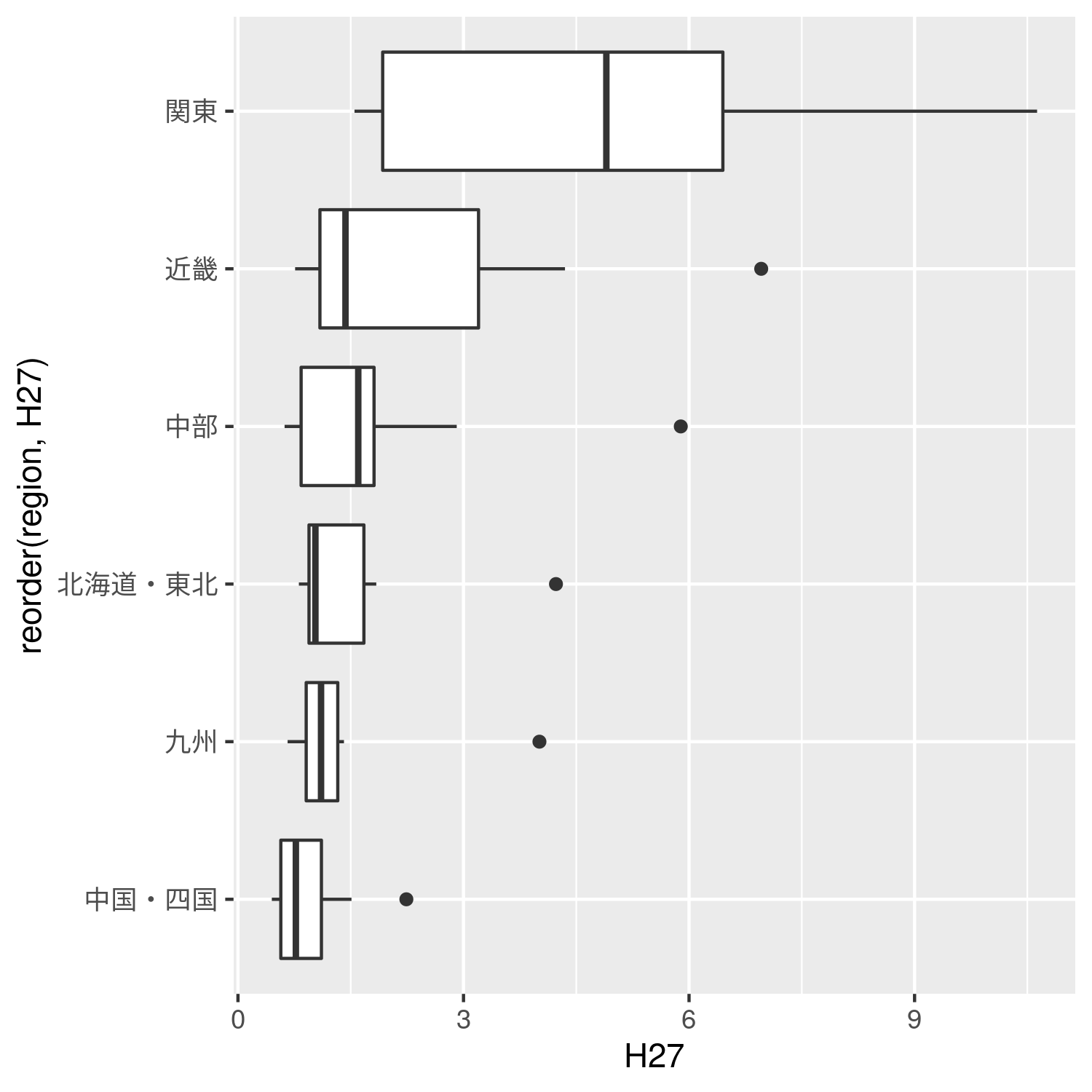
- abc <- ggplot()+
- geom_boxplot(data = data,mapping = aes(x =reorder(region,H27),y=H27))+
- #coord_flipを追加
- coord_flip()
- ggsave(file="boxplot1.png",plot = abc,width = 5,height = 5)
色付き+散布図箱ひげ図
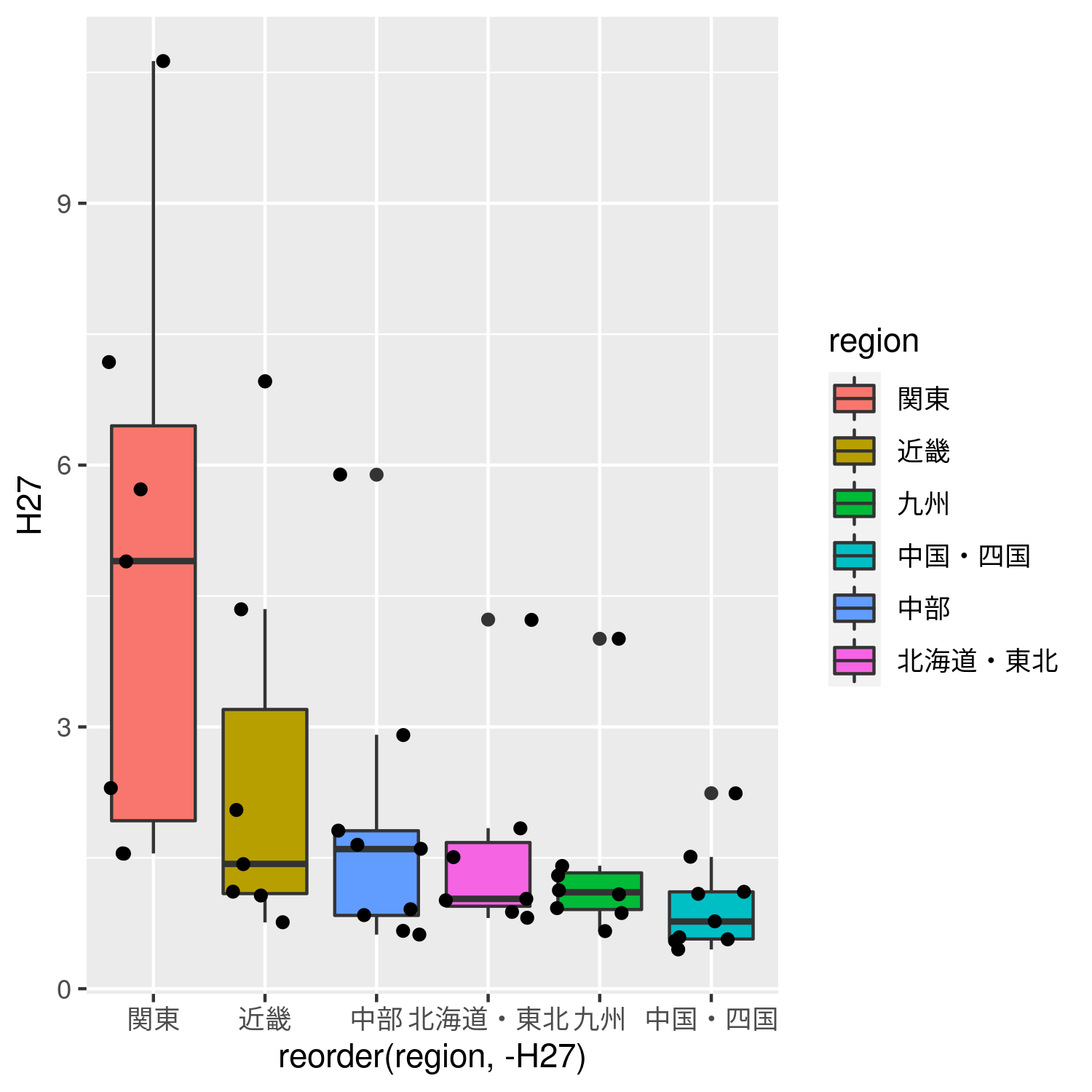
- abc <- ggplot(data = data,mapping = aes(x =reorder(region,-H27),y=H27))+
- #地方ごとに色を区別するfill=regionを追加
- geom_boxplot(mapping = aes(fill=region))+
- #geom_litter()で散布図を追加
- geom_jitter()
- ggsave(file="boxplot2.png",plot = abc,width = 5,height = 5)